
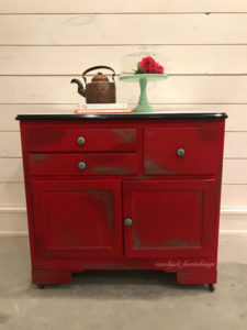
That awesome vintage looking cake stand I used for staging is a gift from a dear friend. I was so happy to get to use it for this! The copper tea kettle was a flea market find. 🙂
Every time a piece turns out as fabulous as this one did, I think to myself “how am I ever going to replicate or top that?”. It’s an intimidating feeling, but I do love a challenge. And I think that’s what makes pieces like this so great. I could have just painted it red and left it, as was my original plan. But I wanted to push my creative boundaries with this one.

I chose to go to the opposite side of the color wheel – green – at the risk of it possibly ending up looking seasonal. But there is more than one shade of green and the color combination actually ended up suiting this vintage gal really well.

I love this original enamel top!

I just had to have a fun pop of color on the inside. Then it was super fun to bring a touch to the outside as well.
The colors I used are Annie Sloan Emperor’s Silk for the base, and the green highlights are a combination of Heirloom Traditions Privilege and Annie Sloan Antibes Green. Then there is a touch of Annie Sloan Old White and some strategically placed Annie Sloan Dark Wax. The piece is finished with General Finishes High Performance Topcoat in a flat sheen. I didn’t want it to look glossy at all because I didn’t feel it would fit the era of the piece and would take away from the vintage feel of it. Lastly I dressed her up with some vintage turquoise knobs from Hobby Lobby (they have the BEST selection of knobs and pulls to choose from!).

I never know how much color will be too much for someone to envision in their home decor, but this gal sold from a sneak peek I posted on my Facebook page! Hooray! I think I’ll continue to dare to use color and wait for the right person who sees the beauty in it. It’s so much more fun than painting something neutral just so it will sell faster. Thanks for stopping by! #creativehappylife


Leave A Reply